Graphics
Prior to anaylzing the data, normality tests were conducted by drawing boxplots (Fig. 3). After checking their normal distributions between independent variables in vigor class1 and in vigor class 2, I drew barplots (Fig. 4) to visualize the difference between means. And I did T-tests to figure out whether there are significant differences between independent variables in vigor class 1 and in vigor class 2. It was resulted that only DBH was correlated to vigor class (p=0.03296).
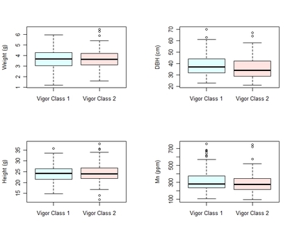
Figure 3. Boxplots to test normality and equality of variance.
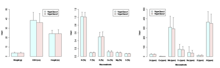
Figure 4. Barplots. DBH, N, Mn, Fe, Na, and Al looked higher in vigor class 1 than vigor class 2.
To look into how DBH is correlated to vigor class, I drew growth curves using tree ring widths data. As seen in the Fig. 5, the trees classified as vigor class 1 (n=202) have been growing more than the trees (n=118) in vigor class 2. This symptom has been evident since 1980s.
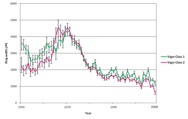
Figure 5. Tree ring widths divided by vigor class.
